
Sales Performance Dashboard
Fiscal Year Sales, Customers & Profitability Insights

Building the Sales Performance Dashboard:
Process and Reflections
Introduction
I turned a raw Excel extract into a multi-page Power BI report that answers Maria's monthly question automatically and goes further. Maria, in sales enablement, was spending around three hours each time transforming the extract into a spreadsheet, which was then forwarded in different versions to stakeholders.
The brief set four minimum requirements: a date table supporting an April–March fiscal year, a comparison of the current fiscal year with the same period last year, filters by Sales Order, Product, Customer and Region, and a view of the monthly trend and best-performing region. My aim was to meet all four, then add views that make the report actionable rather than just descriptive.
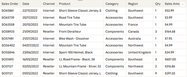
Getting to know the dataThe extract had six sheets: a Sales fact table of 85,701 order lines and five lookup tables for Sales Order, Product, Customer, Reseller and Sales Territory. All values are in US dollars.My first surprise was that there seemed to be no dates at all. On closer inspection, OrderDateKey held dates stored as numbers in YYYYMMDD format, such as 20221215. Converting it in Power Query revealed a range of 14 January 2021 to 15 December 2022.Profiling the data also turned up several quality points I noted to raise rather than hide:• Not-applicable keys: reseller sales carry a Customer key of −1, and online sales a Reseller key of −1.• Missing discount detail: Unit Price Discount Pct is 0 on every row, yet sales show about $486k of discounts.• Partial periods: January 2021 and December 2022 are part months, and the first fiscal year (FY21) holds only three months.• Empty territory: Corporate HQ exists as a region but has no sales.

Building the model built a star schema, with Sales at the centre and each lookup table joined many-to-one with single-direction filtering. This keeps filters predictable and avoids the ambiguous results that two-way relationships can cause. At the heart of the model is a single Calendar table, marked as the date table. It holds both calendar columns (Year, Quarter, Month) and fiscal columns (Fiscal Year, Fiscal Month, Fiscal Quarter) for the April–March year. A Has Sales flag stops comparisons running past the last sale on 15 December 2022, so a part year is never compared with a full one. On top of the model I wrote DAX measures in layers:• Core: Sales Value, Order Count, Units Sold, Total Cost, Profit and Profit Margin %.• Time intelligence: Sales FYTD and Sales PY FYTD with a 31 March year-end, giving year-on-year variance and growth %.• Customer: active, new and returning customers, where "new" means no purchase before the selected period.• Ranking cards: text measures such as Top Country, Fastest Growing Country and City Needing Attention. With FY23 selected, the model shows $36.10M of sales against $24.02M for the same period of FY22, growth of 50.3%.
Challenges and how I solved themMost of my learning came from things that did not work first time, and each one taught me something about how Power BI thinks.The first problems were in the model itself. When I linked the date table to Sales, Power BI placed the Sales date on the "one" side of the relationship, even though each date repeats across many orders. Rebuilding it as many-to-one from Sales to the date table fixed this. Soon after, my year-on-year figures showed zero because both measures were returning the grand total. Testing each measure on its own card, against a figure I knew, showed me exactly where the logic broke.I also hit the error "a single value cannot be determined" several times. It happened whenever I created a row-level formula as a measure rather than a calculated column. Learning the difference between the two, and checking which table was selected before adding a column, stopped it recurring.The hardest issues came from dates. At one point I had two date tables, so my New Customers measure never saw the year filter and showed every customer as new. Separately, my slicers showed only one year because a hidden filter and a date range built from the Sales table were limiting the date table. Consolidating everything into one Calendar table with fixed dates, holding both fiscal and calendar columns, solved both.Some problems were about the details of visuals. My colour rules did nothing until I realised they defaulted to "Percent" of the range rather than actual values, so I switched every rule to "Number". One chart collapsed into a single "(Blank)" bar because the country field came from the Reseller table while the measure counted customers. Using the Customer table's country fixed it. Finally, my order count ignored the slicers because it counted the Sales Order table directly; counting orders through the Sales table made it respond correctly.The rolling averages taught me the most about honest reporting. The data starts in January 2021, so a 12-month line cannot be valid until January 2022. I limited it to complete windows and used a 3-month average for the longer view, rather than show a misleading climb.

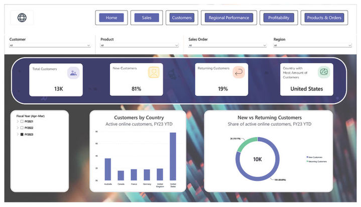
Designing the report and what it revealedThe report has six pages: Home, Sales, Customers, Regional Performance, Profitability, and Products & Orders. Navigation buttons link them, and four synced slicers (Sales Order, Product, Customer, Region) sit across the top of each page. The Sales page carries the fiscal-year slicer, KPI cards and the FY23 vs FY22 monthly chart that answer the brief directly.Beyond the requirements, the report surfaced findings that Maria's spreadsheet could not:• Online surge: monthly online orders jumped from about 300 to around 1,600–2,000 from April 2022, and 92% of FY23 orders were placed online.• New customers: 81% of FY23 customers were buying for the first time, so retention is the next opportunity.• Smaller baskets: average order value fell from $7,926 to $2,270 as small online orders took over.• Profitability: margin rose from 8.6% to 10.6%, but some regions run near or below break-even, and 55 of 237 products sold at a loss.• Category mix: bikes earn 83% of sales, while accessories carry a 52% margin and grew more than eightfold.• Reseller risk: online sales grew almost everywhere, but over 60% of reseller cities declined.
Reflections and next stepsThe biggest lesson was that a sound data model matters more than any single visual. Most of my problems traced back to the date table or a relationship, not to chart settings. I also learned to test every measure on a simple card against a known figure before trusting it in a chart.I changed my approach to dates more than once, moving from fiscal to calendar and back. It taught me to settle reporting conventions with the business at the start, then hold one standard across the whole report.To build this into a standardised process, I would:1. Point the source at the file share and publish to the Power BI Service.2. Set a daily scheduled refresh through a gateway, so the report updates without manual work.3. Add row-level security by region, so each manager sees their own data in one shared report.4. Replace emailed spreadsheets with report subscriptions and data alerts.5. Validate the reseller margins and missing discount data with the finance team.Together, these would remove Maria's three-hour manual task and give every stakeholder a single, consistent version of the figures.

Let’s Work Together
Get in touch so we can start working together.